
Paint tests on Fredrix Canvas METALLICS!
Whenever I try out a new surface I always dedicate one to absolute experimentation.
I use as many paints as I can in an attempt to learn the surface and see how it reacts to my materials. It’s always messy and usually not great looking at the end, but always fun.
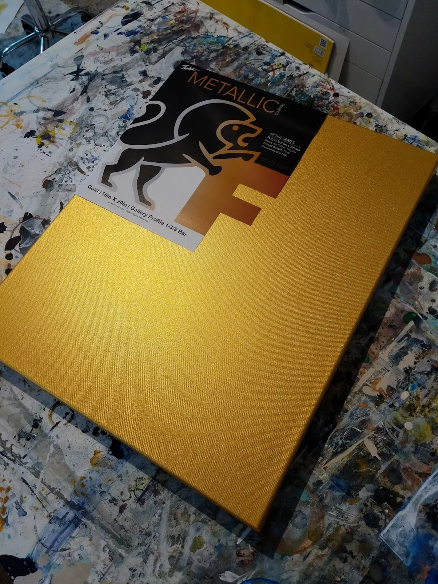
Look at that SHINE.
This is the metallic gold canvas, from Fredrix Canvas. It’s a 13 oz poly/cotton canvas that has been triple primed with a universal metallic gesso (either in gold or pearl) and it’s GORGEOUS to behold.
I haven’t used too many pre-painted canvases before, so I definitely wanted to make sure and do an experimentation round first.
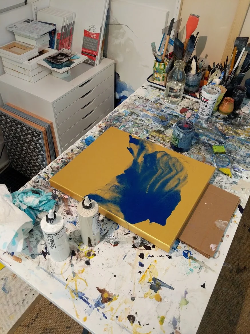
Layer 1: Thinned acrylic
I didn’t have a plan when I started (the key is experimentation) so I just started mixing and putting down various layers. This first one is a heavily thinned acrylic (water + glazing medium) to see how the gold comes through a very light wash of pigment.
Layers 2 and 3; Golden Hi-Flow (unthinned)
After letting the blue dry I added two layers of Golden hi-flow paint without diluting either color. I’m loving how the sheen of the canvas comes through these first three layers.
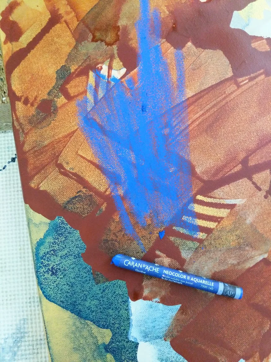
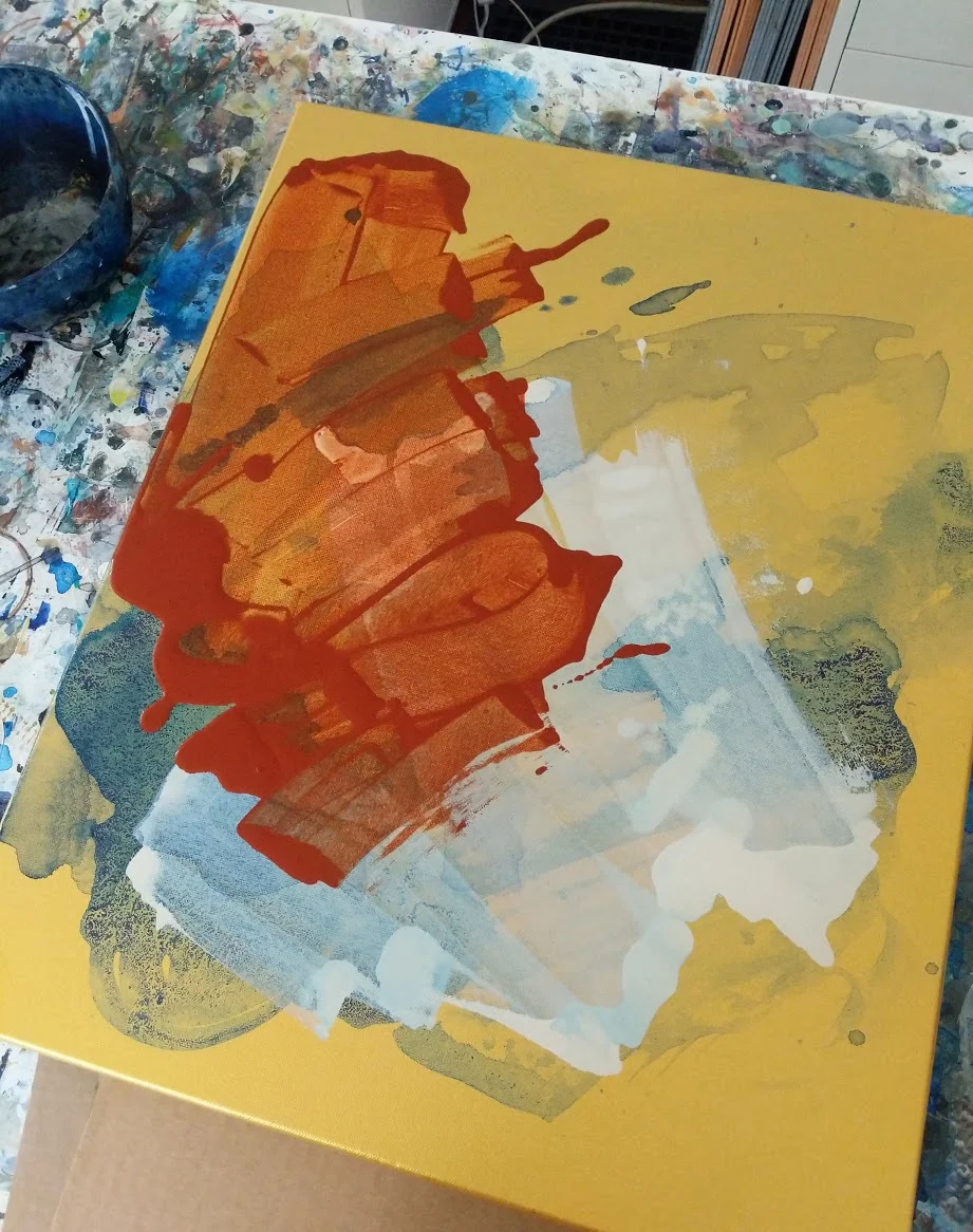
Layer 4: Watersoluble pastel
Next up is a bit of water-soluble pastel. I added it with a relatively heavy hand as I wanted as much pigment as the crayon could muster.
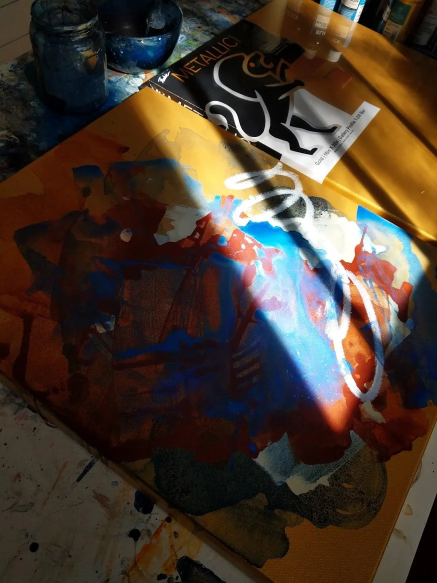
Layer 5: tempera stick
After the water-soluble pastel dried, I wasn’t too excited with it. Just a bit too thick and really seemed to cancel out the metallic sheen. I made a note to stick to thinner paints going forward - I love the metallic hints through the layers so I definitely want to preserve those.
I added a few circles of tempera stick next (bottom right of the canvas) and was pleased with how smoothly they applied to the surface. Again though, just a bit too opaque - so I probably won’t use these heavily on a real painting, but good for small details and line work.
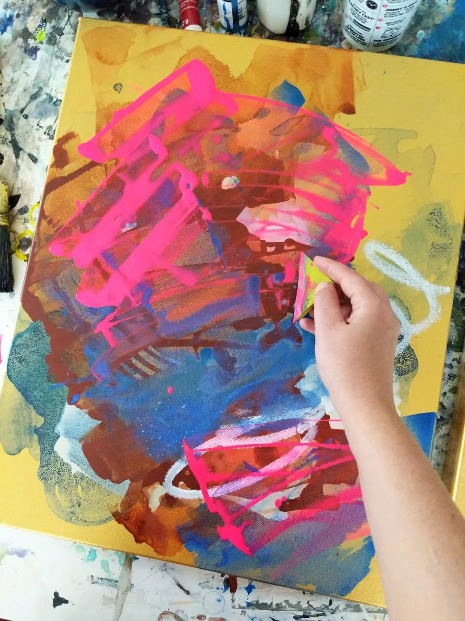
Layer 6: slightly thinned florescent!
And finally I added a last layer of ever-so-slightly thinned florescent pink acrylic. I was curious how the bright color would interact with the metallic under the layers, and it’s definitely something I want to pursue further.
I’ve got a few ideas for sketches that I think would translate well to the gold surface, so I’m excited to move on to a little more serious work on these.
Have you tried a metallic canvas before? I’d love to see what you painted on these!